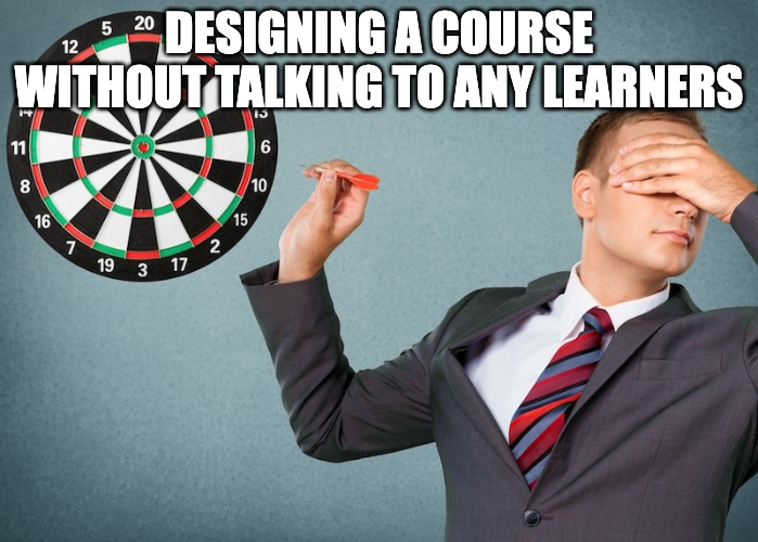
How NOT To Design Learning Experiences
We're all familiar with those learning experiences that leave us feeling like we've been hit by a truck – disengaged, confused, and wondering why we even bothered. But have you ever stopped to think about what makes those experiences so bad?
In a playful twist, let's turn the tables and explore the dark side of learning design. By shining a light on the common pitfalls and missteps, we can gain valuable insights into creating truly effective and engaging learning experiences.
After all, sometimes the best way to appreciate the light is to understand the darkness. So, buckle up and prepare for a humorous journey through the world of terrible learning design!
1/ Skip the needs analysis; assume you know what learners want.
2/ Drown learners in irrelevant content.
3/ Lecture them into oblivion.
4/ Ban all forms of interaction or collaboration.
5/ Create a chaotic and disorganised learning journey.
6/ Provide zero or unhelpful feedback.
7/ Ignore learner questions and concerns.
8/ Use outdated and clunky technology.
9/ Make the learning platform a labyrinth of confusion.
10/ Forget about accessibility; one size fits all!
Now that we’ve had a good laugh (and perhaps a few flashbacks to our own learning nightmares), let’s remember the true purpose of this exercise. By recognising these common pitfalls, we can consciously avoid them and strive to create learning experiences that are the polar opposite – engaging, motivating, and truly impactful.


